To Examiner.
Thankyou very much for looking at my blog and I hope you enjoy it.
Frankie
x
Friday, 10 December 2010
Thankyou
Posted by Frankie Collen at 02:55 0 comments
Labels: Thankyou
Thursday, 9 December 2010
Evaluation - Question 4
How did you use new media technologies in the construction and research, plannning and evaluation stages?
http://show.zoho.com/document.do?p_id=1002515000000004015&TP=false&DOC=Evaluation%20-%20Question%20Four&a_t=VIEW_DOCUMENT
Posted by Frankie Collen at 08:49 0 comments
Labels: Evaluation
Wednesday, 8 December 2010
Evaluation - Question 3
What have you learned from your audience feedback?
This the the third question; I presented these as posters. To view larger images click on the link below the images to access them at Glogster.
Concept Feedback 
Rough cut Feedback 
Final Video Feedback
Ancillary Task Feedback
To get as much feedback as I could I uploaded my video to youtube and used facebook networking site in order to reach the target audience and to be open up the amount of feedback which I am able to collect. Doing this allowed the audience to decide for themselves whether they liked it and I was able to see there opinions.
The feedback which I collected was very constructive and I was able to make changes and adapt my video causing it to get better. I felt that this was important because I am then able to develop it. Collectig feedback at all the stages meant that I was able to keep on track of the things which worked and what didn't. It was key for me to do this during the construction stages so I still had time to be able to make changes.
If I was to re do this project I would look into collecting a wider audience by using more than one type of networking site like myspace or bebo. This would open up my audience feedback and allow others to watch and comment upon it.
I wouldn't make any changes to my video because I feel that my video tells the narrative and expresses the emotion well. But if I was to re do the album cover and magazine ad I would look into more female solo Indie artist so that I could look into more detail for me to collect ideas. For me, this was the hardest stage. There needed to be a link between it all and I found this difficult to do. I looked at many album covers and it was hard for me to picture how I wanted my album to look. Establishing the star and yet keeping to the indie genre was a difficult task but I believe that I accomplished it.
Posted by Frankie Collen at 13:31 0 comments
Labels: Evaluation
Tuesday, 7 December 2010
Evaluation - Question 2
Evaluation - Question 2
This is a presentation which links my products together and all in one.
For me, I found this the hardest thing to do because I couldn't imagine it; this made it difficult for me to link it all together. However I managed it and if I was to do this again I would plan in more detail the album cover and the magazine Advertisement. I think that my advertisement is rushed and I think I could have made it better, but thats if I was to re do this project.
Posted by Frankie Collen at 15:01 0 comments
Labels: Evaluation
Monday, 6 December 2010
Evaluation - Question 1
Posted by Frankie Collen at 08:57 0 comments
Labels: Evaluation
Friday, 3 December 2010
Magazine Advert
Posted by Frankie Collen at 08:00 0 comments
Labels: Ancillary Tasks
Tuesday, 30 November 2010
Album Cover & Digipack


Posted by Frankie Collen at 07:25 0 comments
Labels: Album Cover, Ancillary Tasks
Monday, 29 November 2010
Feedback - Final Music Video
I've shown my music video to friends and family so I am able to collect some feedback about the music video. This is the feedback which I have collected:
- There is a clear story and its a very powerful and emotional story
- Its well edited together and there is equal amounts of narrative with performance and they don't over power each other
- The effects I have used compliment the video and don't over power the video
- The effects highlight the music genre which I aimed to achieve.
- The fade out is one of the best moments along with the pushing towards the end. The way it is edited together makes it look professional and smooth.
James Horwood - "Thats a really original storyline. Its normally shown in a very different way. The use of sterotypes and symbols are really well used! Good job! I love it!"
Posted by Frankie Collen at 07:17 0 comments
Labels: Feedback
Friday, 26 November 2010
Music Video
Posted by Frankie Collen at 06:23 0 comments
Labels: Video
Sunday, 21 November 2010
Album Cover & Digipack First Draft

Posted by Frankie Collen at 08:52 0 comments
Saturday, 20 November 2010
Re - Shoot
From our feedback I decided that it was important for me to add some extra footage to my music video because I felt as though it became very boring and its better to have more than not enough. This meant I need to do some more planning about what scenes would be good to film based on my facebook.
- Needing to show we live together
- Could include an argument
- More moments where we are a couple
These are key features which we filmed and I will edit into my video to improve it and make it more professional. While it was easy to shoot and this day was very productive and quick as we were on a time limit. It was crucial that we got this filming done as soon as possible so I am able to have enough time to edit it into my video.
Posted by Frankie Collen at 12:08 0 comments
Wednesday, 17 November 2010
Album Cover - Audience Feedback
My Album Cover


Here are the amout of people which agreed with the pictures. They are in order of above.


I think its really important to see what the audience looks at when they want to buy an album, its clear that they have seen that the pink dress is clearly appealing to the male eye, based on things which they have said. After looking at the pictures there are some that would not be suitable for my image and what I want to be seen as. It doesn't match my song and the feel of my video.
So I took the second picture which was next choosen and decided that I wanted to see what effects I would add to the picture to make it more creative and similar to that of Alanis and Imogen. This is the when I first started playing, the first design which I liked because its slightly moody and it would still appeal to the target audience. However I think this would be more appealing as a single release instead of on front of an album.

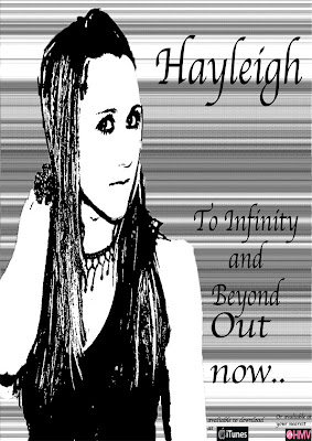
Below is my first attempt at an album cover art. I like the theme of black and white which runs through this design but I have just began to get use to the software and I am finding it interesting and I want to continue with this idea.

Posted by Frankie Collen at 12:28 0 comments
Labels: Album Cover, Audience, Feedback
Sunday, 14 November 2010
Feedback - Rough Cut
I showed my rough cut to the class on Thursday 11th November. I collected this feedback based on my rough cut;
- It was suggested that I needed to add some more scenes in about the couple as it was too repeative with the two scenes that I have.
- It needs to be reinforced that we live together and its not just his house I'm walking into.
- I need to double check my lip syncing because it was out of time.
- The effects which I have put in my video are relevent and help to improve it. It looks good and just need to keep the effects going throughout the whole video.
- There is a clear story and narrative and they link together. They are presented nicely and the studio scenes are nicely filmed and put together.
Britney Spears - Everytime
From this video, I like the beginning where they are fighting against each other and arguing. This is seen through them pushing each other and the expression. However, my original idea of smashig a vase is seen in this video also and its a very effective way to show anger. Further they break more than just one thing and I would like to try and replicate a scene similar to this to show the emotion.
Bleeding Love (version 2) - Leona Lewis
There are some interesting shots and sequences which I'd like to include within here to show the situation. The opening scene is a small arguing which I would like to incorporate. This isn't as extreme as the one from Britney Spears and I think it will be eaiser to do but I would like to try it because it this would be more appropriate to the scene. There is a scene where he is packing up his things to leave and this would be a powerful scene for me to try and include because it shows I live there and heartbreak which I want the audience to feel.
Bleeding Love (version 1) - Leona Lewis
This video is all about heart break and there are many scenes in this video which I would like to try and replicate. Its really important for me to be able to see a variety of scenes so that I have a range which I can choose from to include in my video. Its important for me to be able to show how I am feeling the us as a couple.
Posted by Frankie Collen at 09:57 0 comments
Friday, 12 November 2010
Rough Cut
Posted by Frankie Collen at 02:01 0 comments
Labels: Rough Cut
Tuesday, 9 November 2010
Indie Album Covers Research
While looking at these artist, it would't apply directly to my song and album. Although I have a female solo artist, it doesn't account for the music genre. As I am releasing a Indie Album my album cover needs appeal to the target audience. Therefore, looking at relevent artists would be key.
Alanis Morisette


You can see from this album art that shes not the center of the piece and you don't see her face fully. There are a range of different effects on the album covers as she isn't the center and she has presented herself in a particular way to create an image which is suitable to the specific audience. Rather than looking at her body a key focus is her face and shes presented in a beautiful mannor rather than a way which presents her as sexy. Her name is seen clearly while the name of the album isn't the center of the piece, which helps me when I am creating my album. She has two names which I think is important feature to these artists and I will need to take into consideration when creating my artist name and image.
Imogen Heap


Her album covers have similar charactersitics as Alanis. There are different effects which are used within the album and she isn't looking at the camera either. It focus's on differet aspects. While the first album creates an unusal image for her but it is related to the music genre which is what I hope to portray in my album cover art.
I like the effects which have been used in the last two albums as they are similar. Black and white with little colour. I would like to try this effect and create an image based on a picture where I am not the center of the album to match the genre which I am appealing to.
KT Tunstall


Now KT Tunstall has different album covers they similarly are in black and white; showing the effects and they aren't focused on her body and focus on the image which she is presenting. Her name is clearly shown and the name of the album is seen. This is different to the two other artists, I think this is because she is a more current artist and is more recent having her albums released in the past ten years.
But I think that I would like to present my artist more similar to Alanis because I think her image is created more clearly and more appealing to the target audience which I am appealing to.
Posted by Frankie Collen at 08:52 0 comments
Labels: Album Cover, Ideas
Sunday, 7 November 2010
Album Cover Ideas
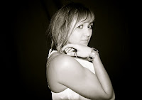
Here are some of the pictures which we took to be part of the digipack and a possible album cover. I need to choose an album cover which will represent the star and the music which will be on the album, but I need to make it appeal to an audience as well.
This is the picture which I would like to put as the album cover as it has me in the center and it portrays me in an indie/rock kinda way with the background and pose. But there are several other pictures seen below which could also be used as my album cover. I will using the social networking site Facebook to see which one is more popular to a target audience. 


Posted by Frankie Collen at 06:35 0 comments
Labels: Album Cover, Audience
Friday, 5 November 2010
R&B Album Covers Research
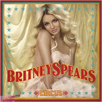
Britney Spears

From these two Britney Spears Covers you can see that she is the the center of her album and the cover to showing her. They are two clear different pictures and different images of her portraying her in two different ways. While Toxic is portraying a younger version and is creating a sex appeal to the audience her more recent album of Circus is portraying her as an innocent. It is appearing to be an older fashion with the hair and clothes and the look on her face. This seems to be a similar trend for female artist to be on the cover as this is seen from Shakira also.
Shakira

We can see Shakira is on the front and the center of the portrait. From the first Album cover from an older album, there is more of her figure and as Shakira developed she is known for her dancing and her star image has been similar throughout her career. Shakira genre of music is different to Britney Spears but they are both on the front of their album covers. This is seen also from Christina Aguilera, Cheryl Cole and Rihanna.


However, this is very different for the Indie Genre
Linkin Park & The Used

On both of these covers, neither of the artist are featured on the cover. The covers are representing the genre of the album and presenting the 'feel' of the album itself. This is very different to the solo female artists above. While they focus on Star image, this indie/rock genre focus on a representation of the album.
Looking at the two main genres which I would like to appeal to helps me to make crucial decisions about the album artwork and digipack which I will be creating. I will need to be sure that I include characteristics from both genres which will mean I will try and combine the two album works.
Posted by Frankie Collen at 11:09 0 comments
Monday, 1 November 2010
Day Two Shoot

Day Two Shoot
This day was also very successful; we managed to film more than we planned. We faced a few problems on this day which we had to overcome for example we needed to film other scenes which we originally planned for another day of shooting, but we needed the same location thus we had to think quick on our feet to get the right arrangements on the Monday before the shoot. There were several things which we had to do on the day like take the picture of George and myself for the photo frame. This was easy as we waited for us all to get together to travel to the locations; the locations were locate so they were easy to access.
A problem which we were faced with which we feared about was if the photo frame didn't smash when we dropped it. To work around this we took different shots where the audience would see the photo which she was carrying. We decided to be discrete to make it more interactive for the audience and used symbolism rather than literal meaning. Another problem we were faced with was the dog which the house owners have, we had to keep him out of the shots so they didn't ruin the moments, this can be seen in the video below where we forgot on our first take of the shoot. However, we managed to look after him well and keep him amused but also keep him out of the shots.
Posted by Frankie Collen at 03:08 0 comments
Labels: Shoot
Friday, 29 October 2010
Day Two Schedule
10.15 // Notepad scence. Close up of tear drop on page, wirting Numb and opening and closing book,
10:30 // Looking out of the window, close up of face
10:40 // Setting the scene. Put clothes on stairs, check the frames and do a practice/test shoot. POV shot of her looking at clothes
11.00 // Long shot of walking into the house, and dropping frame
11:30 // Different angles of frame (CU, Long shots, POV shots etc.)
1.30 // POV shot of clothes on stairs
1.45 // Mid shot of emotion on face. (dibelief, shock)
2.15 // MS to LS of her leaving, camera stays still. Other angles of her leaving (higher and lower angles)
2.45 // Double check all footage. We know if we need to re-shoot parts.
Posted by Frankie Collen at 07:42 0 comments
Labels: Planning
Wednesday, 27 October 2010
Day One Shoot
 Day One Shoot
The first day of the shoot was very successful. We used the hours in the studio to our schedule and it was very accurate and precise.
The first day was very fun to shoot and we got a rage of angles and shots which I will be able to use. It was successful because we achieved what we aimed for and it was a good day.
We collabourated well together discussed the different angles and how it looked. We needed to change the microphone because it didn't work well with my performance in the video. It was good as we worked together to keep to our schedule and to stay on time. Above are pictures which we took throughout the day and the different jobs which we had to do.
Posted by Frankie Collen at 13:27 0 comments
Labels: Shoot
Monday, 25 October 2010
Preparations

These are the final conclusions about filming of my music video. It includes all the key features like the the location, costumes, actors and Props. Its important for me to be clear about all the things which I will need to have and be prepared for.
Posted by Frankie Collen at 09:34 0 comments
Labels: Planning
Wednesday, 20 October 2010
Shot List
This is the shot list which contains all the shots which we will be filming and what will be seen in all the shots. Its important to have the key points and moments in the in video.
This is our first version of the shot list and includes all the main components which we are going to include. Below is the finalised shot list.
Shot no. / Shot / Location, actors, props.
1. Close up - Shes not looking at the camera; shes looking out of the window. It will be in Mrs Baldwin house. We'll need water to make it look like shes crying and I'll be the only one in the shot.
2. Close up - It will of a notebook and like a tear dropping ontp the page on the word 'Numb'. It will be in the house and will need a notebook, pen and water. 
3. Mid shot - Establishing the the scene and we see her singing into a microphone with her, looking and listening to the music; this will be in black and white. It will be in Park High Studio and I'm in the shot and there won't be any props but there will be background Mise en scene which shows the studio.
4a) Long shot - To establish scene and following them as they are walking on a bench. It will be in centenary Park. There will be two actors, Frankie and George holding hands and in love. There won't be any props in the shot.
b) Mid shot - In front of them sitting on the bench.
5. Close up - Up to her face and want her to be the main focus in the shot. It will be in the studio it will be from a different angle and closer up.
6. Long shot - It will be from behind the TV looking at the them together. The lighting will be dark and the lighting will come from just the TV, like watching a movie. It will be at the house on the sofa cuddling and becing really close.
7. Mid shot - Back into the studio, from a different angle onto the other side.
8. Long shot - From the side and quite low down. It will be in the Park on the bench and we watch George get up and he leaves Frankie.
9. Close up - Back into the studio from a high angle to show the her.
1oa) Mid shot - walking into the house. She walks into the house and closes the door. I look happy looking down and holding a photo frame of George and myself.
b) Point of view - Looking at the stairs and seeing clothes scattered up the stairs. After I'm in the house, the audience doesn't see me. They see the clothes on the stairs of a girl and a boy indicating he cheated on her. 
c) Close up - My hand starts to drop with the photoframe. It has to be a close up of my hand clear and obvious that its my hand.
d) Extreme Close up - The frame dropping to the floor and smashing.
11) Mid shot - Back to the studio to watch me perform.
12) Close Up - Back to the house to see me in disbelief and shocked.
This video is a practice of how I would like the frame to drop. Its important to get practice for the final shoot and to get an accurate view of the shot which I would like to see. This shot works really well, and intertexuality here as it has been done in several other music videos, but also in movies and TV shows to indicate an emotion of shock and devestation.
Posted by Frankie Collen at 04:19 0 comments
Labels: Planning


